Set IJburg — Website Redesign
Web Designer
Web Designer & Developer Client: Set IJburg — Neighborhood community center (Amsterdam, IJburg) Year: 2026 Scope: UI/UX design · Front-end development · WordPress integration

Set IJburg — Website Redesign
Role: Web Designer & Developer Client: Set IJburg — Neighborhood community center (Amsterdam, IJburg) Year: 2026 Scope: UI/UX design · Front-end development · WordPress integration
Overview
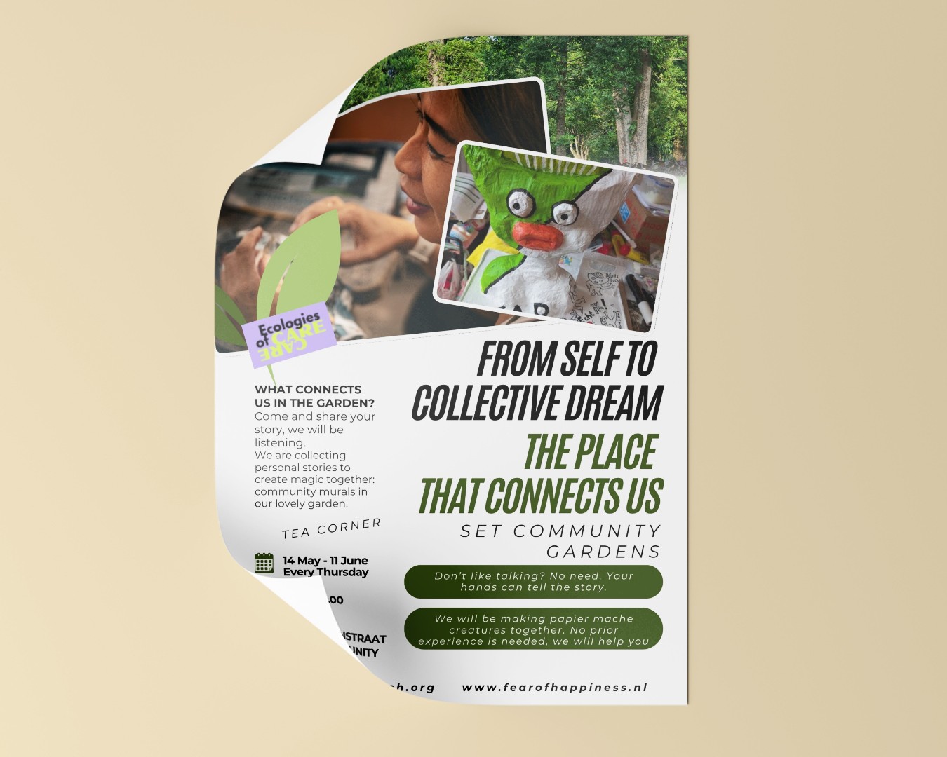
Set IJburg is a buurthuiskamer — a neighborhood living room — on Amsterdam's IJburg island. It's a space where residents (including statushouders and long-time locals) come together for shared meals, workshops, cultural events, and everyday connection. As a member of the hosting team, I'm close to how the space operates on the ground, which shaped how I approached the redesign.
Challenge
The existing website worked functionally, but visually it felt stuck in an older era — generic WordPress styling, flat layouts, and little of the warmth the place actually radiates in person. Visitors landing on the site wouldn't get a sense of the energy inside the building: the food, the faces, the weekly rhythm.
I initiated the redesign myself, driven by a simple question: why doesn't the site feel like the place?
Process
1. Understanding the audience
Set IJburg serves a wide mix — neighbors dropping in for a buurtdiner, statushouders finding community, volunteers running programs, people looking to rent the space. The site had to speak to all of them without feeling generic. That meant prioritizing clarity (what's happening, when, how to join) while making the visual language feel human.
2. Design direction
I built the visual system around natural, grounded tones — forest greens, warm amber accents, and cream backgrounds — paired with DM Serif Display for headlines and Plus Jakarta Sans for body copy. The goal was something that reads as welcoming rather than institutional.
Key decisions:
Movement over static — scroll-triggered reveal animations give the page rhythm without being distracting
Real people, real photos — the team section uses actual portraits of the hosting team with short personal bios, because the place is the people
Clear content hierarchy — agenda, news, and participation paths (organize, volunteer, rent) each get dedicated sections
3. Building it
I wrote the entire front-end from scratch in HTML/CSS/JS and integrated it into WordPress page by page. The architecture includes:
Homepage — hero, agenda, news preview, about, newsletter signup
Wereldhuiskamer page — the shared community room with Google Calendar integration and house rules
Verhuur / Reserveren — rental info with embedded availability calendar
Team section — card-based layout with expandable bios
All pages share a single design system: typography, spacing, color tokens, reveal animations, and responsive breakpoints. Adding new content stays consistent without re-inventing layouts.
Outcome
The new site matches the feeling of walking into Set IJburg — warm, active, and community-first. The hosting team now has a digital space that reflects what they actually do, and visitors get a real sense of the place before they ever step inside.
For me personally, this project sat at a useful intersection: I'm both a member of the community and the designer building for it. That proximity made the decisions easier — and the result more honest.
Credits
Design, development, and photography (portions): Burak Akmanoglu Typography: DM Serif Display, Plus Jakarta Sans Platform: WordPress (custom front-end)