SET-IJBURG: A Typographic Christmas Invite
Flyer
For the annual Christmas Dinner at SET-IJBURG, the objective was to create a flyer that felt personal, warm, and distinctly non-commercial. The event is a donation-based community gathering, so the visual language needed to reflect the "gezellig" (cozy and togetherness) spirit of the neighborhood living room.
The Challenge: Christmas flyers can easily fall into clichés. The challenge was to use traditional holiday elements (red, green, holly) without making the design look like a generic supermarket advertisement. It needed to feel special—like a handwritten invitation to a family dinner.
The Concept & Strategy: We focused on "Handcrafted Warmth."
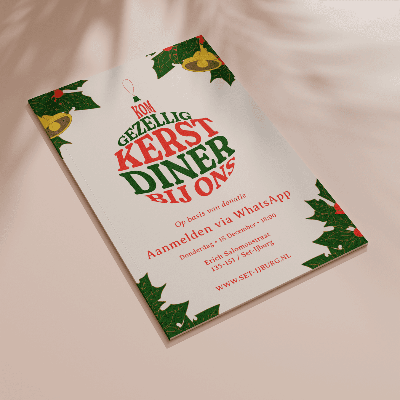
Typographic Illustration: Instead of using a standard stock image of a tree or Santa, the typography became the illustration. I manipulated the main headline—"Kom Gezellig Kerst Diner Bij Ons"—to form the shape of a hanging Christmas bauble. This draws the eye immediately to the core message.
Texture and Color: We used a textured, off-white background to simulate high-quality paper. The font choice has a rough, hand-stamped edge, and the illustrations of holly and bells feel drawn rather than digitally perfect.
Warm Palette: The classic combination of deep red and forest green evokes instant recognition of the holiday season, while the cream background softens the contrast, making the flyer feel approachable and friendly.
The Outcome: The resulting flyer is a festive and inviting piece of communication that perfectly captures the heart of SET-IJBURG: a place where everyone is welcome to share a meal and celebrate together.