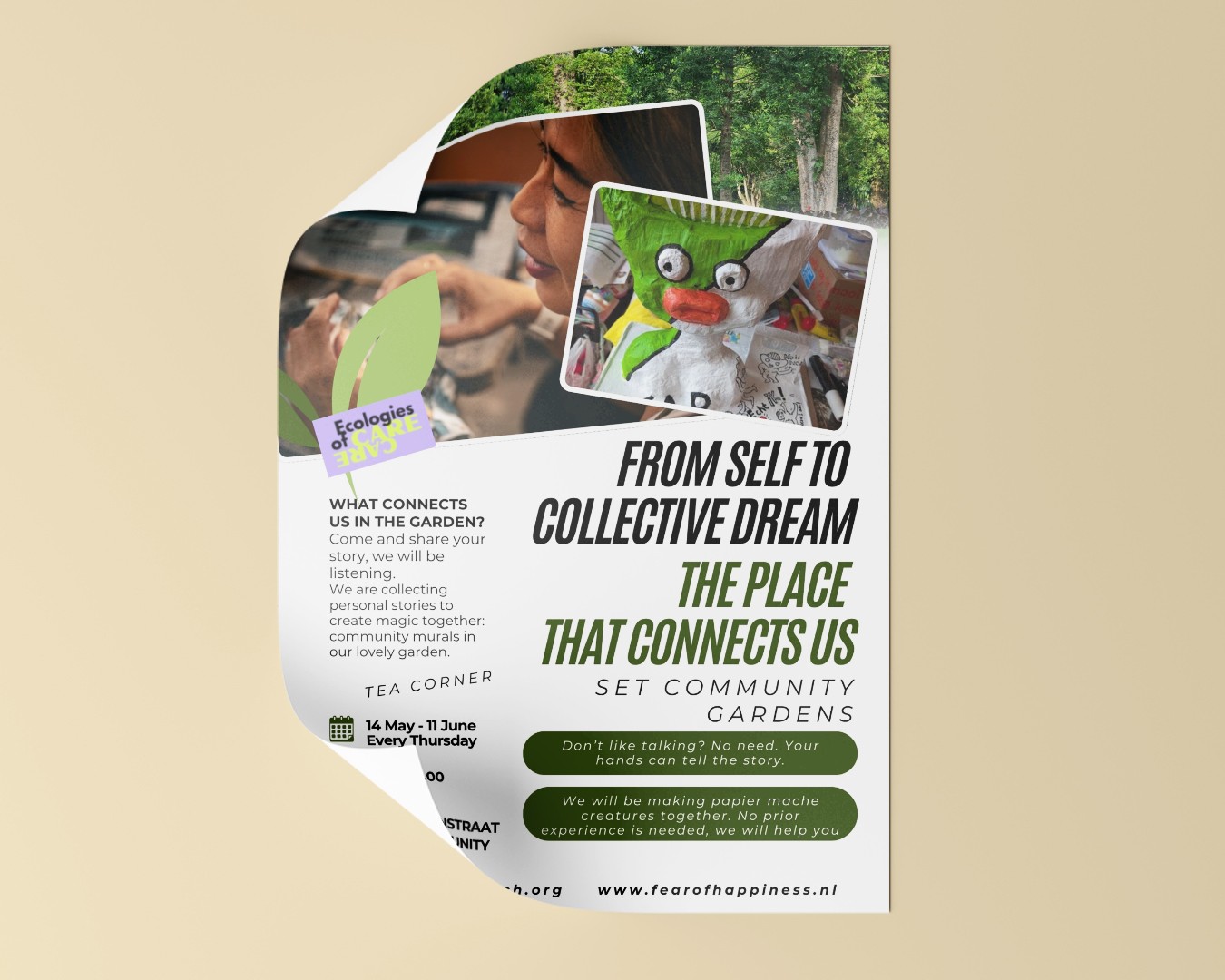
SET Community Gardens: Cultivating Connection & Sustainability
Flyer
This project involved the design of a bilingual flyer campaign (English & Dutch) for the SET Community Gardens in IJburg. The goal was to attract new members for the upcoming growing season and to promote the garden's core values: fighting consumerism, embracing the circular economy, and fostering permaculture.
Community garden flyers can often look cluttered or dated. The challenge was to create a design that felt modern, urgent, and energetic—appealing not just to experienced gardeners, but to younger residents and families looking for community. Additionally, the design needed to accommodate a significant amount of text in two different languages while maintaining the same visual impact.
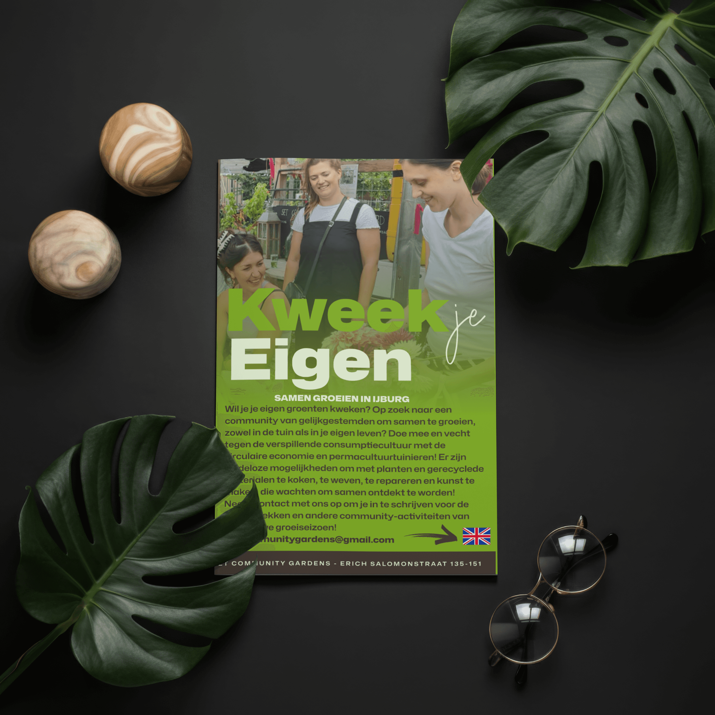
The Concept & Strategy: We developed a visual identity based on "Organic Energy."
Vibrant Palette: We utilized a fresh, punchy lime green as the primary color. It commands attention and immediately signals "nature," but with a modern, almost electric twist.
Typography: The headline treats the text as an image. We mixed a heavy, structural sans-serif font for "Grow/Own" (representing the physical garden beds) with a loose, handwritten script for "your/je" (representing the personal human touch).
Background Imagery: A subtle, photographic overlay of the actual garden provides context and texture without overpowering the readability of the text.
Bilingual Accessibility: The layout was rigorously tested to ensure the Dutch and English copy—which vary in length—both fit perfectly within the grid, using flag icons for quick language recognition.
The Outcome: A dynamic and accessible flyer that successfully positions the SET Community Gardens not just as a place to grow vegetables, but as a hub for fighting waste and building a like-minded community.