LOKAAL 432 – A Call Echoing Through the Streets
Bilboard Design
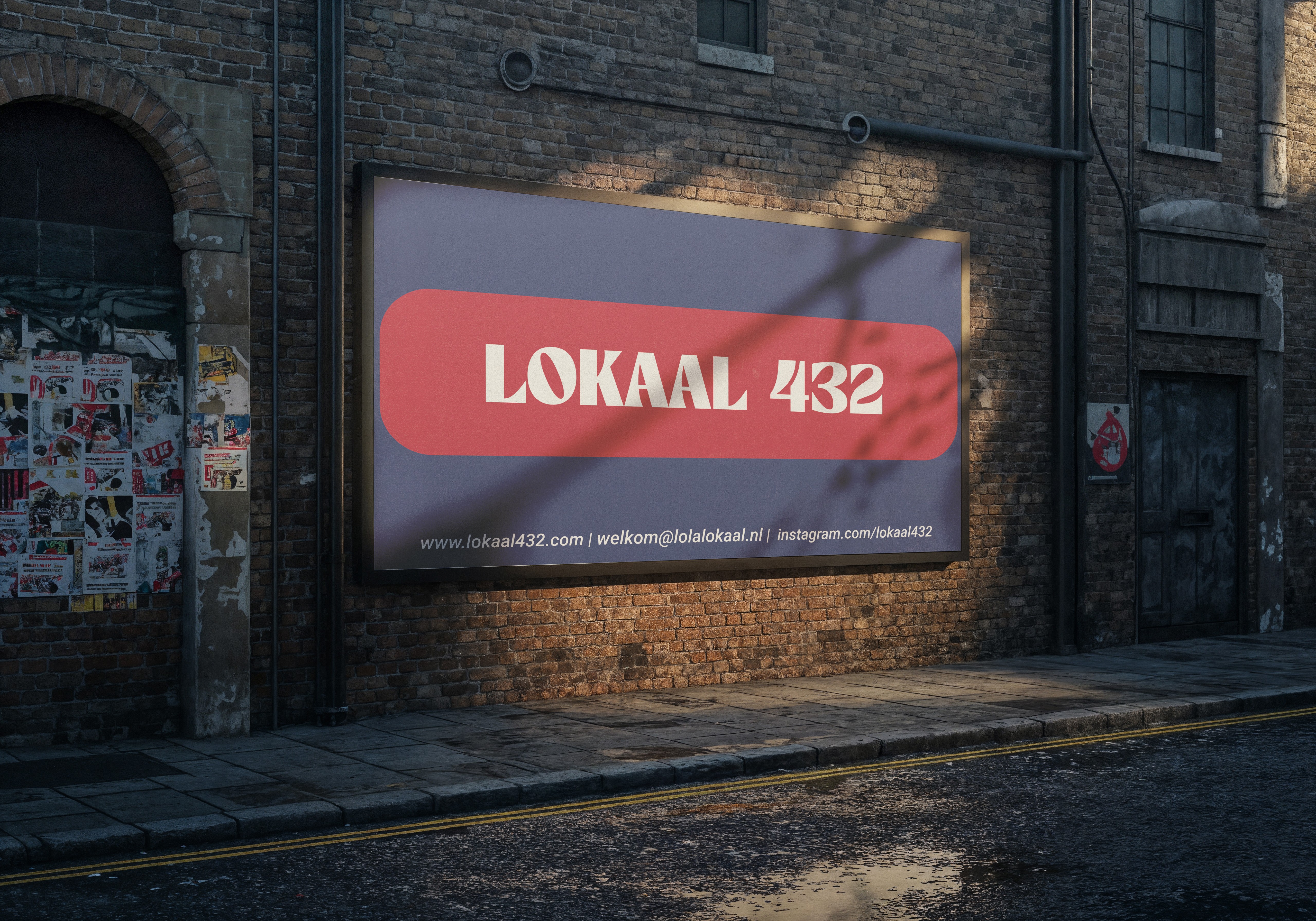
This project explores the translation of the LOKAAL 432 brand from the digital realm to physical spaces, demonstrating how it can establish a striking presence within the urban fabric. The objective was to reinforce the modern and inviting brand identity through a compelling outdoor advertisement (billboard) design that resonates in the streets and directly engages its target audience.

The Challenge
Having already established LOKAAL 432's warm and inviting identity digitally (via website, social media), the challenge was to transition this essence to a physical environment. The goal was to create a message that stood out and was memorable within the bustling urban landscape, without getting lost in the visual noise. The main objectives for a billboard design were:
Instant Recognition: To ensure the brand name and spirit are quickly perceived.
Clear Messaging: To present key communication channels (website, email, Instagram) simply and legibly.
Integration with Environment: To utilize the natural texture of the urban setting (brick walls, street view) in harmony with the design, creating realism and context.
The Concept & Strategy
Our strategy was built on "minimalist impact" and a "direct call to action."
A. Visual Language: Bold and Memorable
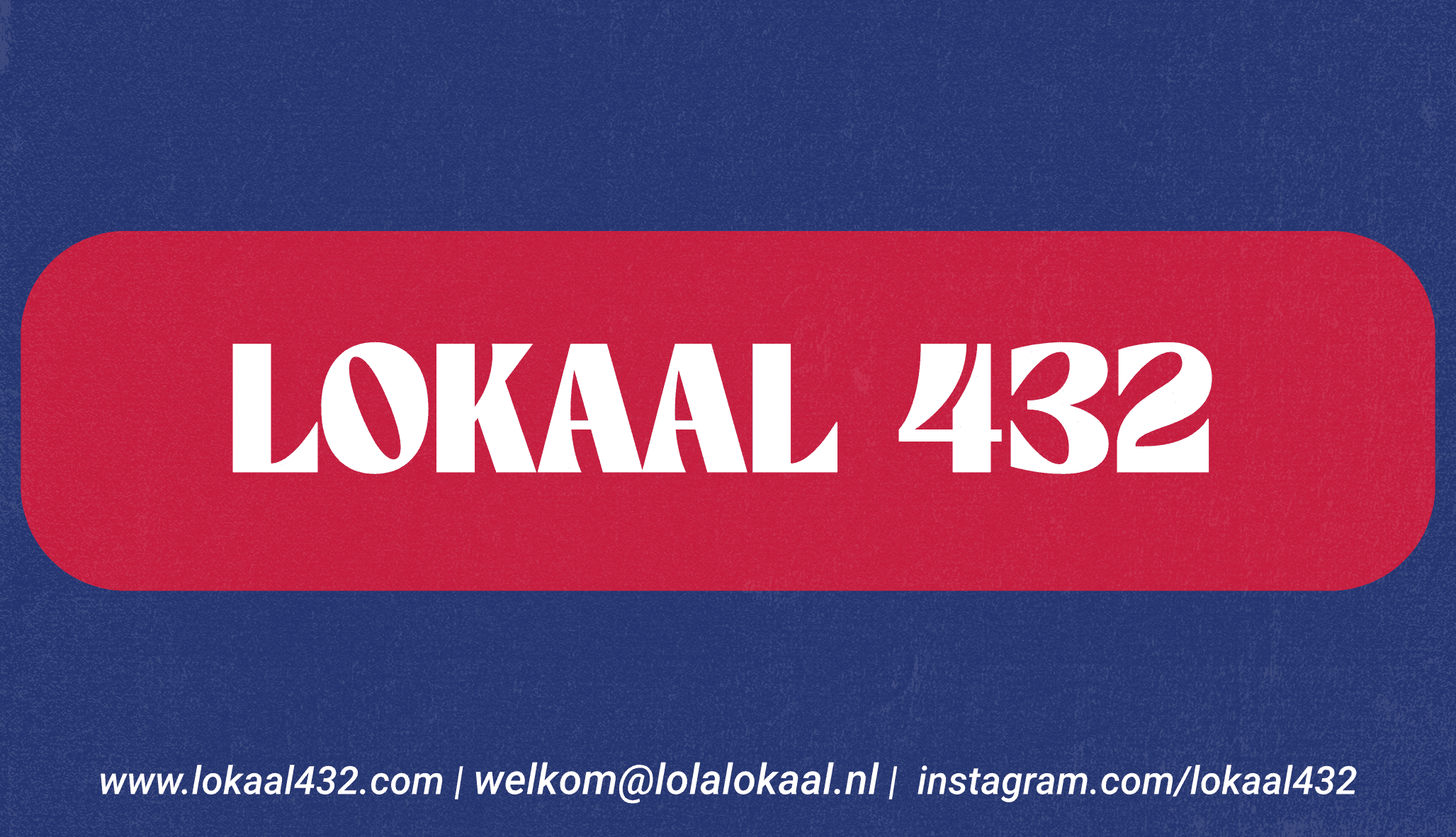
Color Use: The brand's signature reddish-pink (or coral) tone was used against a navy blue or dark purple background, creating an instantly eye-catching, bold contrast. This color combination conveys both energetic and sophisticated feelings.
Logo Integration: The strong, serif-font "LOKAAL 432" logo, chosen in an earlier project, was centrally positioned on the billboard, large and legible. An elongated horizontal "pill" shape in red maximizes the logo's visual impact while providing a dynamic frame.
Font Choice: The font maintained the modern retro feel of the logo, optimized for quick readability in an outdoor setting.
B. Messaging: Accessible and Inviting
Key Information: Below the billboard's main design, essential contact points—the website address (www.lokaal432.com), email address (welkom@lolalokaal.nl), and Instagram profile (instagram.com/lokaal432)—were simply placed. These details serve as direct bridges to the brand's digital ecosystem.
The Outcome
This billboard design powerfully announces LOKAAL 432's physical presence in the city.
High Visibility: Bold colors and large logo usage ensure the brand is easily noticed even in a crowded urban environment.
Effective Direction: Clear contact information ensures that interested individuals can easily access the brand's digital platforms.
Brand Consistency: The modern and inviting identity established in digital platforms is maintained in this outdoor advertisement, offering strong brand integrity.
This billboard demonstrates that LOKAAL 432 is not just a place, but an integral part of the city, actively extending an invitation to everyone.