SET-IJBURG: November Agenda – The Program of Community Spirit
Agenda Design

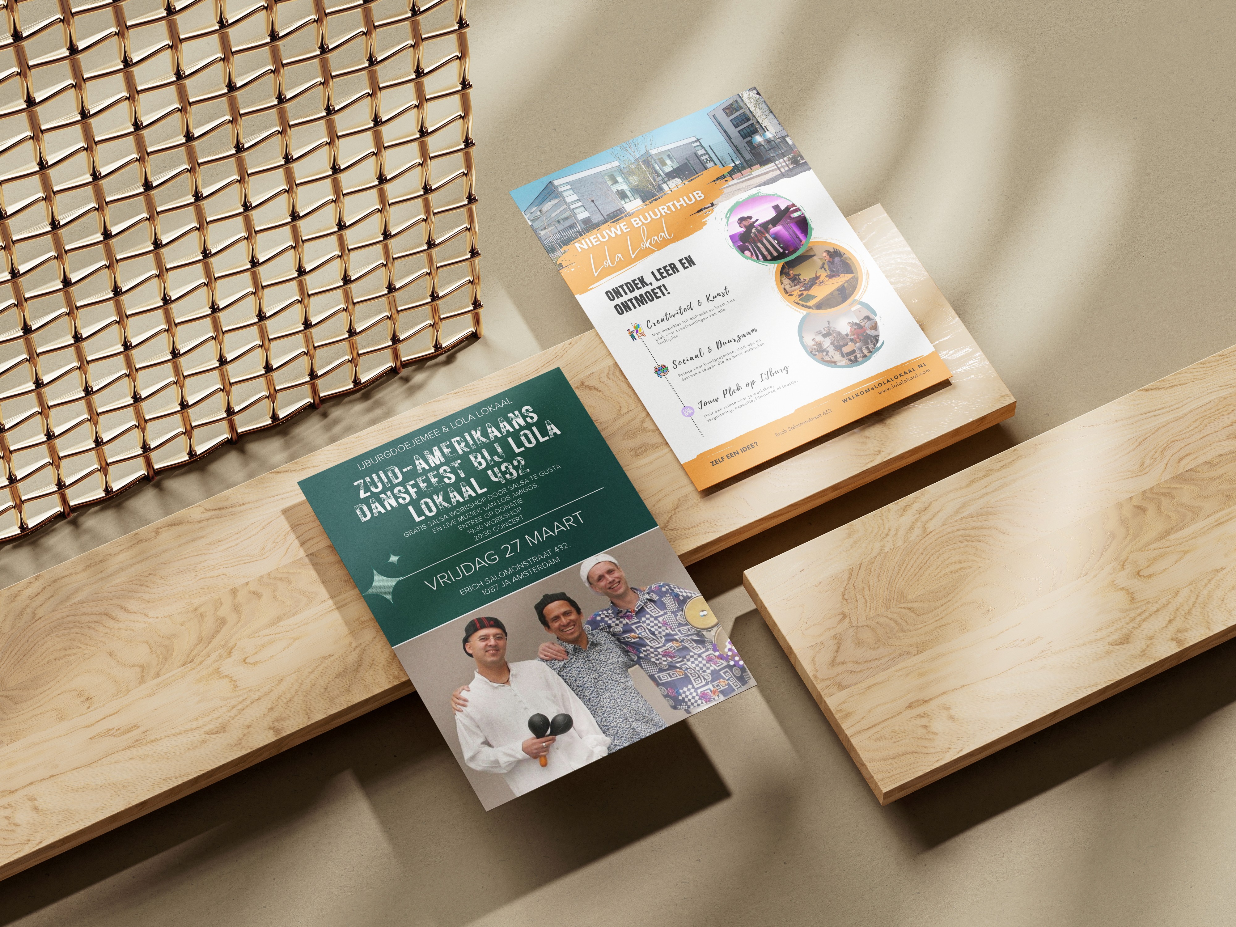
This project encompasses two vertical poster designs created to announce SET-IJBURG's November events. For SET-IJBURG, which embodies the concept of "The Living Room of the Neighborhood," these posters aim to encourage community participation in a variety of activities offered by the center, using a warm, inviting, and informative tone. The design provides a user-friendly experience by presenting both daily regular activities and special events with a clear hierarchy.

1. The Challenge
For a dynamic community center like SET-IJBURG, presenting a wide array of ever-changing monthly events (language classes, workshops, special gatherings) in a clear, attractive, and accessible format is a core challenge. The main objectives for these posters were:
Managing Information Flow: To present a large amount of information (days, times, event names) in an easily readable and digestible manner.
Reflecting Brand Identity: To convey SET-IJBURG's warm, welcoming, and "gezellig" (cozy/pleasant) atmosphere through the posters.
Boosting Invitation: To encourage everyone who sees the posters to visit the center and participate in the activities.
Sustainability: To create a design framework that can be easily updated monthly in a similar format.
2. The Concept & Strategy
Our strategy was built on "Organized Warmth" and "Clear Guidance."
A. Visual Language: Modern and Welcoming
Color Palette: Key colors from SET-IJBURG's brand identity were combined with vibrant orange/terracotta highlights, especially for main titles and important dates. This adds vitality and warmth to the posters, while a navy/dark background ensures information is clearly legible.
Typography: Modern, clean sans-serif fonts were used to ensure clarity and readability of information. However, the use of a handwritten or more playful font for "Agenda" and the day headers supports the brand's intimate, "handcrafted" feel, moving away from corporate stiffness.
Layout: A "weekly calendar" style grid system was employed, with days arranged horizontally and activities vertically. This layout transformed complex information into an understandable structure, allowing the user's eye to navigate the poster with ease.
B. Content Hierarchy: From Important to Detail
Main Title: "NOVEMBER Agenda" is positioned at the top, large and eye-catching.
Daily Activities: Below each day, specific activities and times for that day are listed.
Special Events: At the bottom section of the poster, under the "Special Events" heading, important one-off events are highlighted with distinct orange accents. This ensures users immediately notice key dates.
Informational Details: The SET-IJBURG website address (
www.set-ijburg.nl) is clearly added at the bottom of the poster to facilitate easy communication.
3. The Outcome
These vertical poster designs successfully announce SET-IJBURG's community-focused mission and its rich November event program.
Clarity and Readability: Complex information is made easily understandable through a clean and organized design.
Brand Identity Reflection: The posters visually reflect SET-IJBURG's warm, inviting, and inclusive spirit.
Increased Event Participation: With their eye-catching and informative nature, they have the potential to draw local residents to the center and encourage their participation in events.
These posters serve as an important communication tool, consistently supporting SET-IJBURG's vision of being "The Living Room of the Neighborhood" across both digital and physical environments.


